It’s almost impossible to walk past one of Boo Saville’s colour fieldworks without pausing. The perfect melange of soothing colours, they entice the viewer in an almost hypnotic way, evoking a warm hug in the sunshine. Saville hasn’t always worked with colour – some of her earlier pieces are inspired by death and the detritus of memento mori. But her bright, abstract colour canvases are like the inverse of those: a balm for troubled times that’s akin to having a spa treatment on your wall.
Humans are hard-wired to have strong reactions to colour and that’s perhaps why they are such a fundamental part of many artists’ work, from Tim Fishlock’s carnival tones to Katherine Bernhardt’s Sharpie shades. By understanding the way viewers respond to schemes and tones, an artist can heighten emotional responses to their pieces.
One of the best ways of tracing your own reaction to various shades is to follow Bridget Riley’s work through seven decades of practice. At the beginning of her career, she was known for her monochromatic schemes but, by the end of the decade, she began introducing a highly-controlled colour palette. The tones in her pieces are often inspired by her travels: in the early 1980s, she produced a series with an ‘Egyptian palette’ of terracottas, blues and ochre.
Latterly though, Riley’s colour schemes have evolved with her shapes, becoming bolder and less uniform. By 2019, she’d come so far that her exhibition at the Hayward Gallery was entitled Colour, with bright shades enhancing the shapes, curves and stripes of her work so that it seemed to dance across the walls.
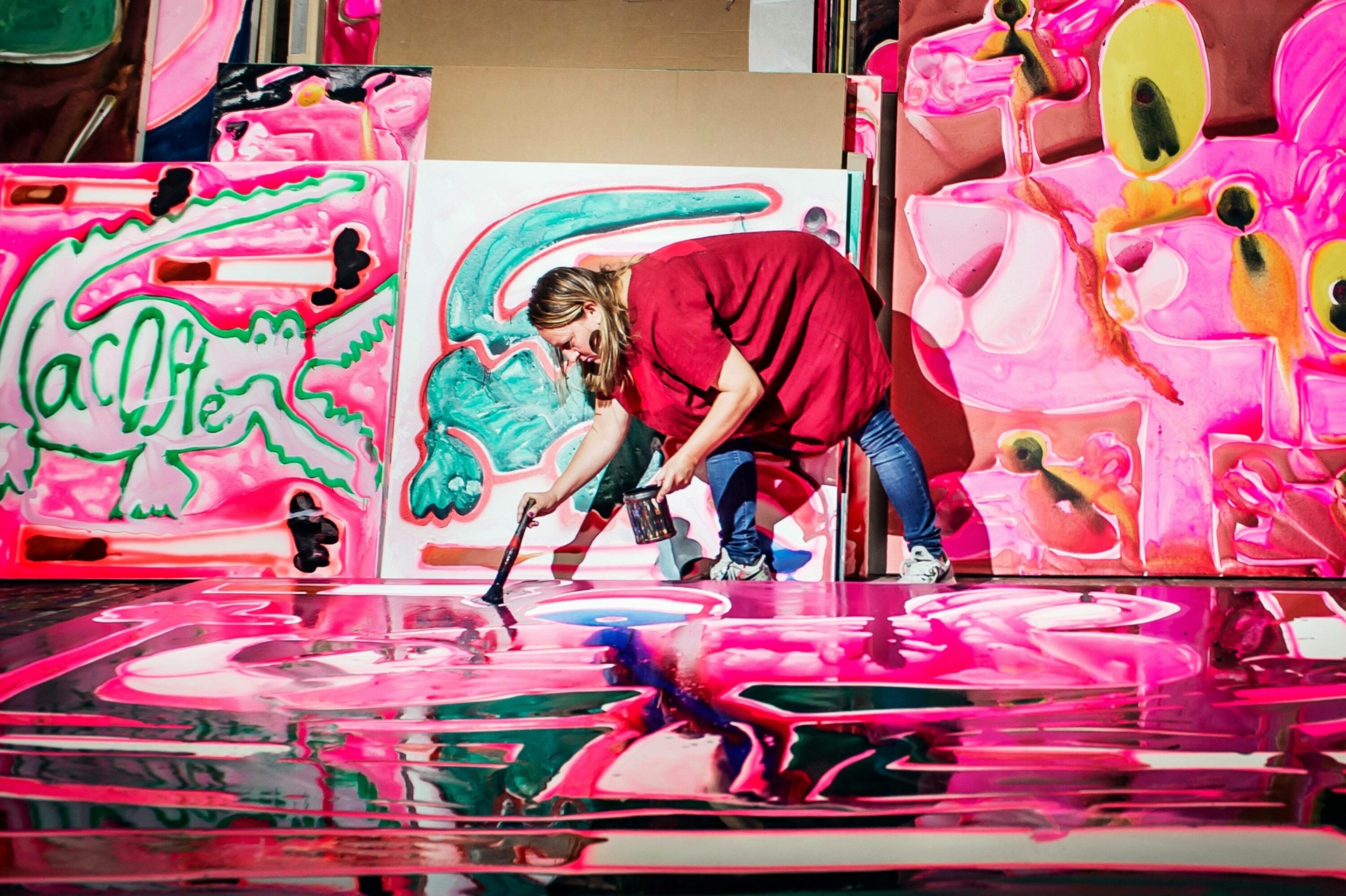
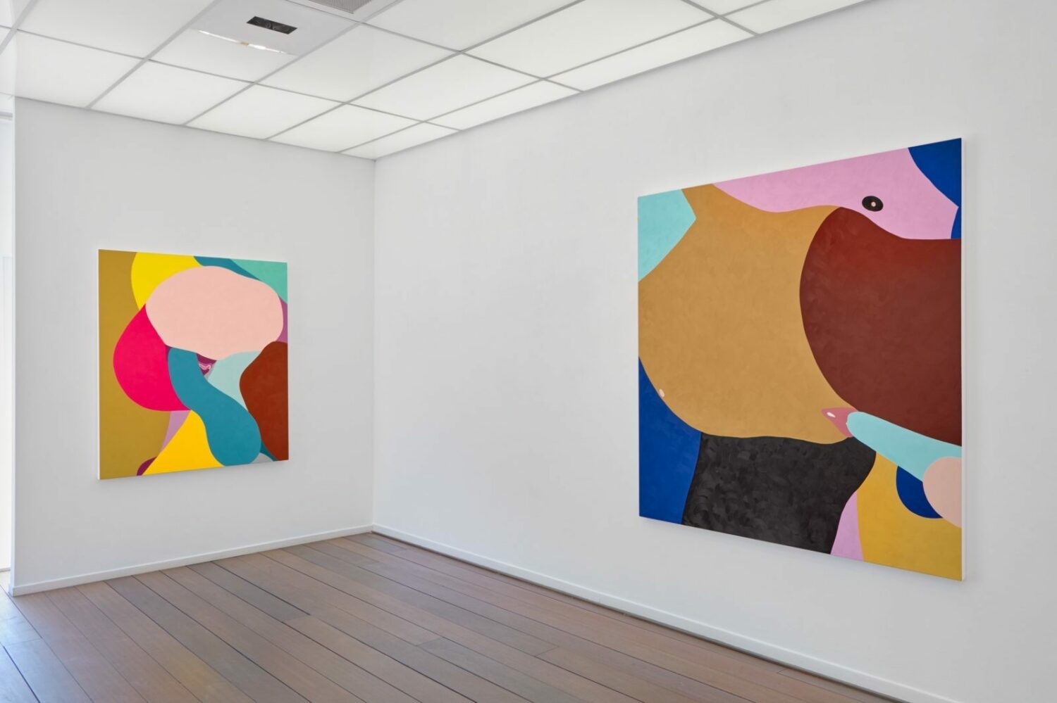
Certainly less subtle but no less visually arresting, Helen Beard’s bold depictions of human sexuality are somehow tempered by the bright, graphic shapes that make them. Impactful and joyful, the colours enhance her celebration of women’s pleasure.
Though Beard makes it look simple, the process of choosing and pairing colours is convoluted and involved. “When you get above a certain number of colours, beyond 5 or 6, it gets really difficult, and it sometimes takes ages to work it out,” she told Paul Stolper gallery. “It’s the juxtaposition that makes the process complex”.
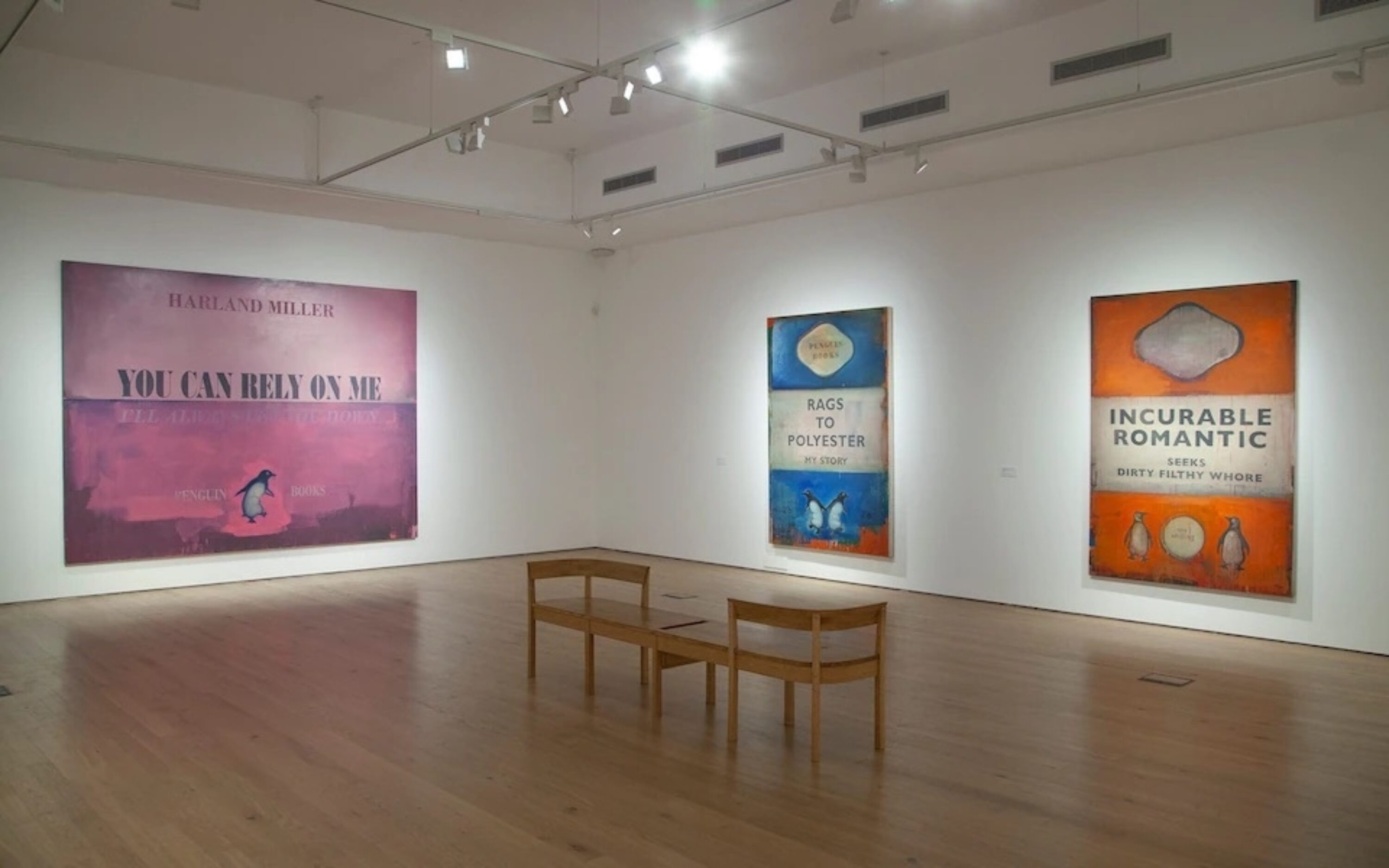
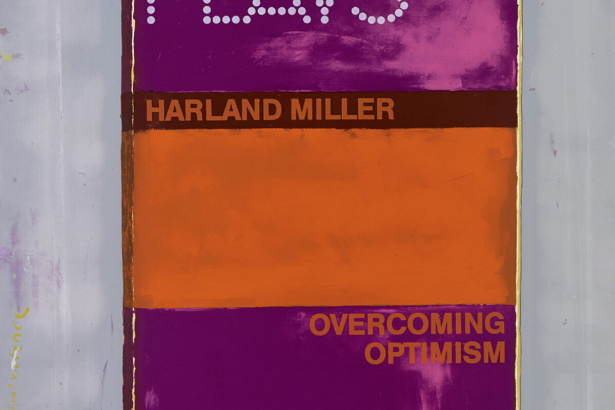
Colour is clearly fundamental to these three artists, but there are others who use their palettes in more subtle ways. In Harland Miller’s Penguin book canvases, different shades are integral to provoking a response in the viewer and evoking a feeling in the painting.
For the exhibition York, So Good They Named It Once, Miller exhibited his Bad Weather paintings, which evoked the feeling of the British seaside. In these, misty blues and fogged-out tones signal stormy seascapes while, in previous work, hot pink conveys desire.
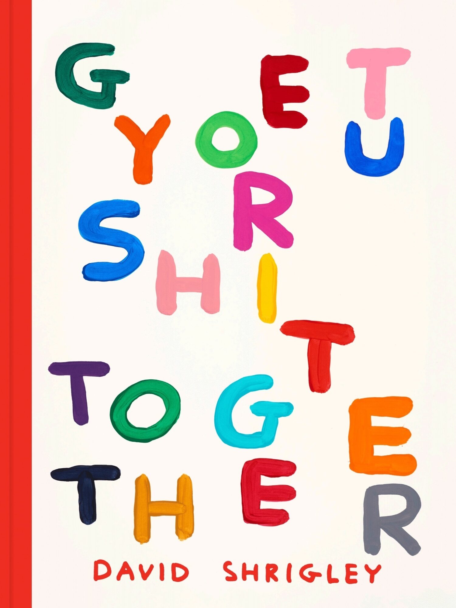
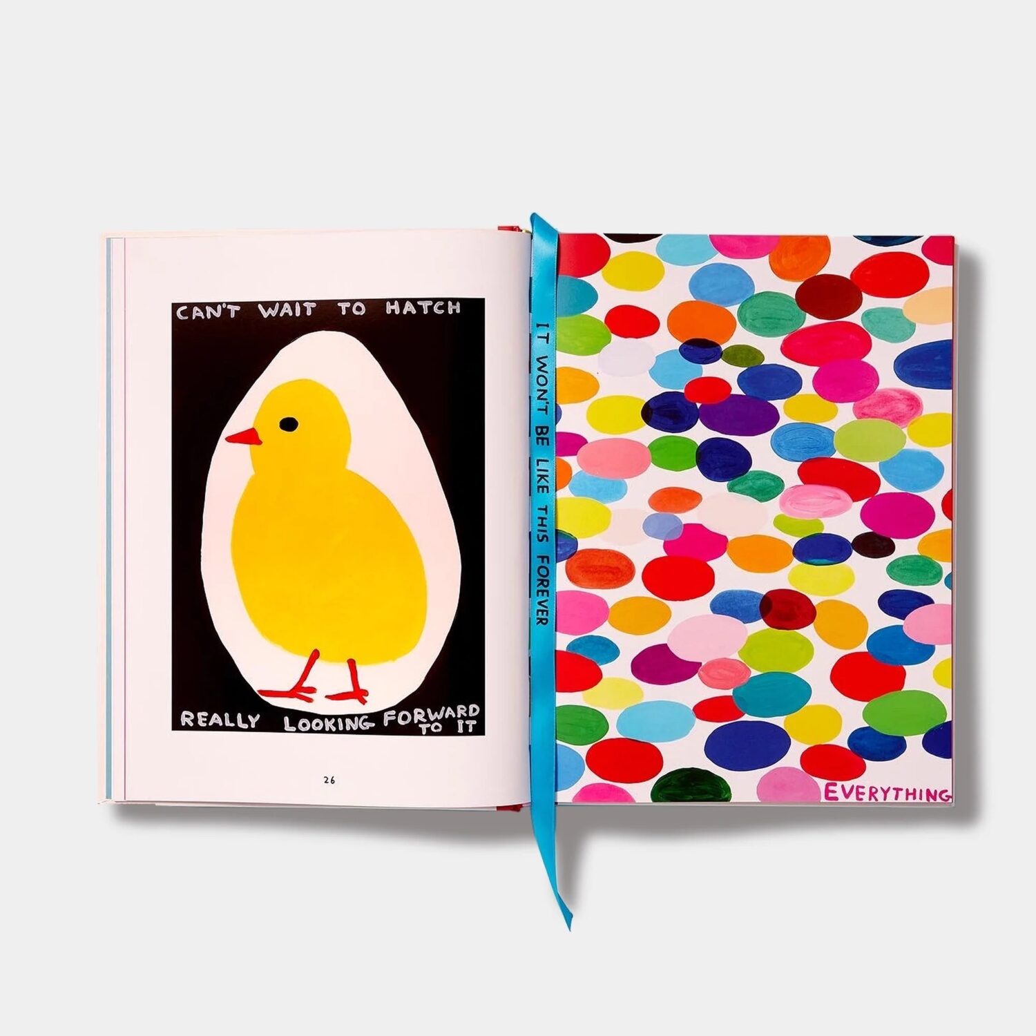
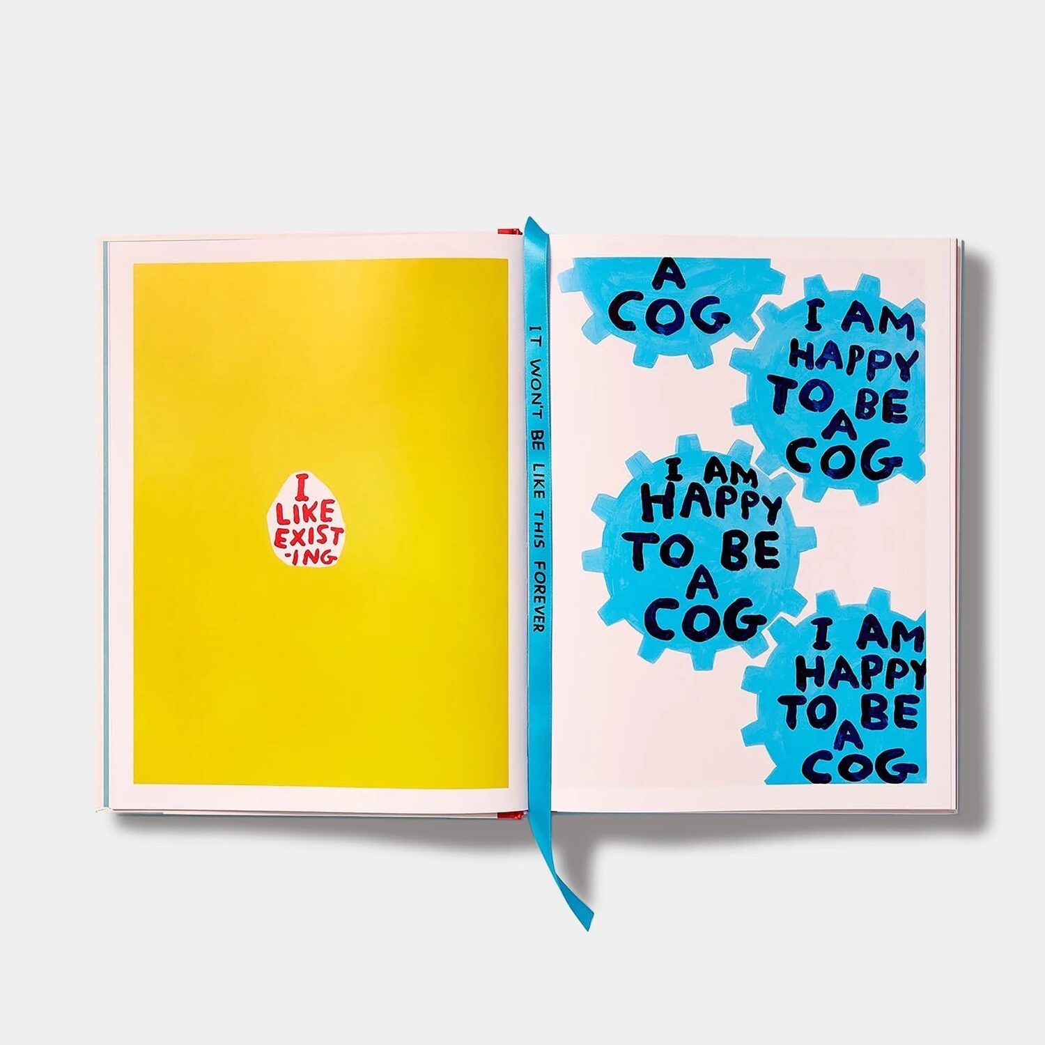
And, if you think David Shrigley’s work seems different recently, it may be down to an injection of rainbow hues. At the end of 2022, Shrigley published his first book in which all the works were in colour, a cheery tome entitled Get Your Shit Together which mirrored his bright Colour & Text lithographs made in the same year. With tiny slogans nestled amid vast swathes of mood-enhancing colour, they’re the ultimate pick-me-up.