More editorials about Harland Miller
Artists
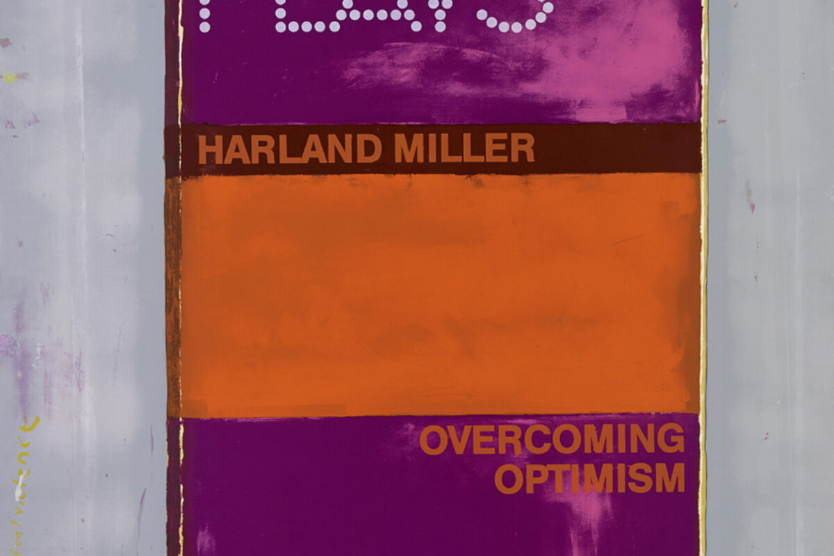
From Rothko to Ruscha: Unpacking Harland Miller’s Influences
10 Jul 2025 | 3 min read
Art Market
Market Watch: Auction highlights | RESULTS Part 2
7 Mar 2025 | 2 min read

Art Market
Market Watch: Auction highlights | Part 2
1 Mar 2025 | 2 min read

Art Market
Market Watch: Auction highlights | Part 1
24 Feb 2025 | 2 min read

Artists
Our Top Exhibitions of 2023
21 Dec 2023 | 5 min read
Artists
All Things Bright and Beautiful
10 May 2023 | 3 min read
Artists
Text Art: A Brief Timeline
20 Apr 2023 | 4 min read
Artists
Pick Up a Penguin
13 Apr 2022
Lifestyle
Quiz Time | Complete the Phrase from the Artist's Work
7 Jul 2021
More from Exhibitions
Exhibitions
In Flux: Kostas on Embracing Chaos, Control, and Creation
21 Jun 2025 | 5 min read

Exhibitions
Kostas Papakostas: In Flux | A Look at the Private View
12 May 2025

Artists
Yayoi Kusama breaks records with the most successful exhibition in Australian history
17 Apr 2025

Artists
Super Woman | Why Tracey Emin standing up to the haters is good for you too
8 Mar 2025
Exhibitions
Exhibition Review | Mickalene Thomas 'All about Love'
12 Feb 2025 | 3 min read

Artists
Hang-Up's Top Exhibitions of 2024
23 Dec 2024 | 5 min read

Exhibitions
Yayoi Kusama at Victoria Miro
21 Oct 2024
Exhibitions
Age of Icons | A Look at the Private View
10 May 2024
Artists
Invader's Immersive Space Station Opening in Paris
2 Feb 2024 | 3 min read