Language is at the heart of our existence – we can only channel and focus ideas if we have the words to voice them. From the calligraphy of medieval Bibles to the fonts of the London Underground, visual language adds an extra layer of depth to the spoken word that’s akin to the intonations of speech. It’s little wonder then, that many artists have incorporated language in their work, using typography, handwriting or spray paint to get their point across.
Since the mid 20th-century, there’s been an explosion of word-based art, with makers challenging perceptions through a mix of bold phrases and beautiful letter forms that convey everything from motherly love to political anger. Read on for more on the artists who’ve shaped the movement...
American Graffiti
Since time immemorial (or at least for as long as we could write), humans have been scrawling graffiti on city walls. For the Ancient Romans, graffiti was a (legal) part of everyday life and the walls of the Empire’s cities and towns acted as early advertising hoardings, ad-hoc visitors’ books or places to express the most precious – or basest – emotions. Just like modern street art, Roman graffiti was sometimes little more than a scrawl and sometimes an elaborately-designed thing of beauty. The messages, meanwhile, veered from the woefully mundane (“Gaius Pumidius Diphilus was here”, as found in Pompeii) to the shockingly profane (“Restitutus says: 'Restituta, take off your tunic, please, and show us your hairy privates”, also found in the city).
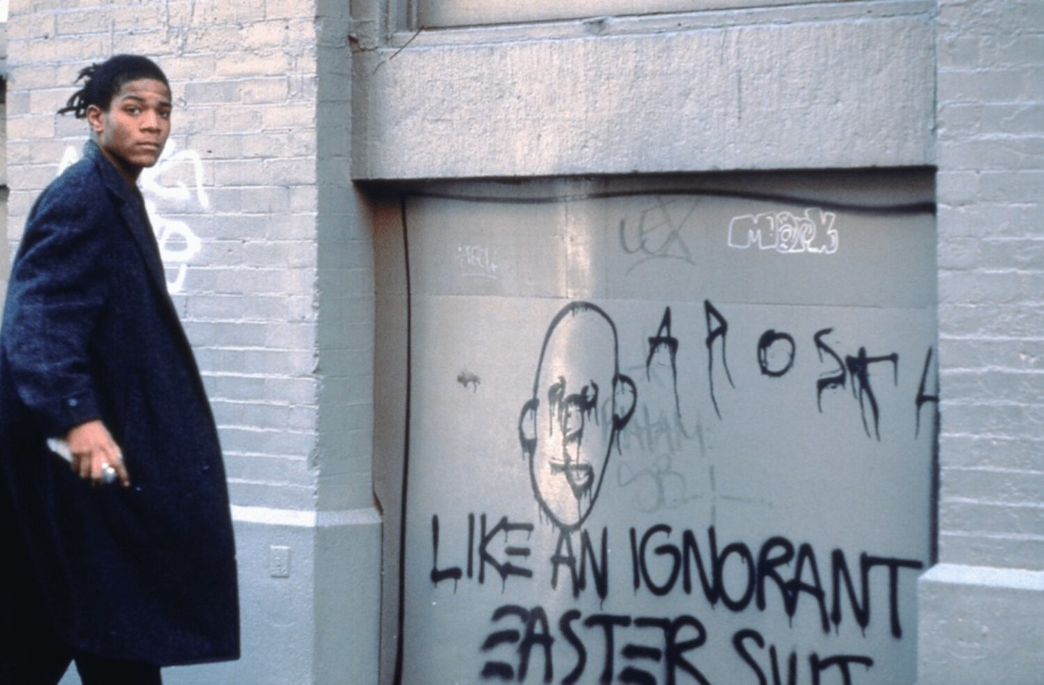
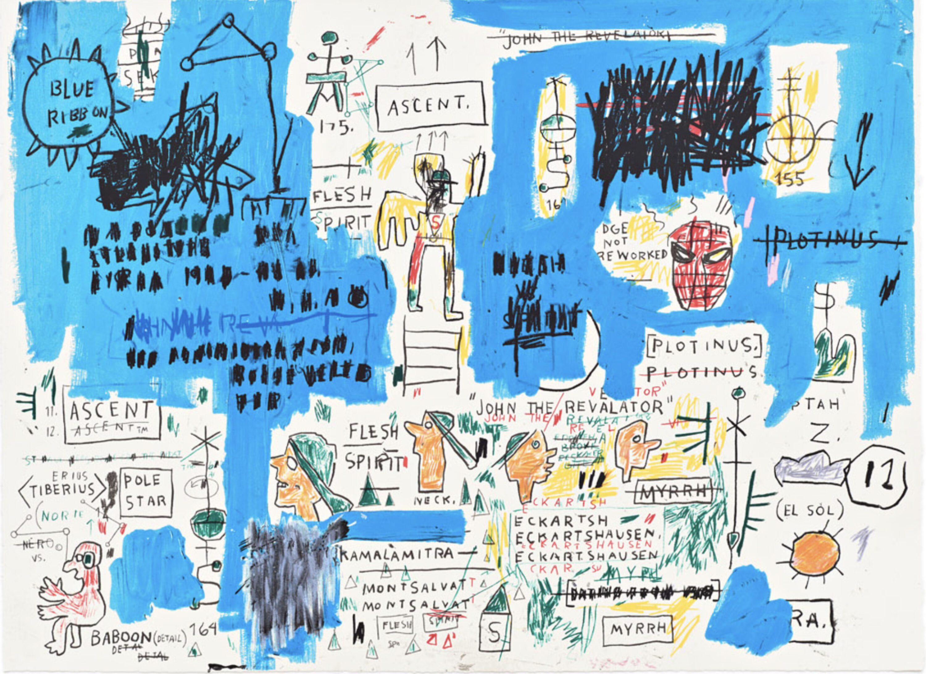
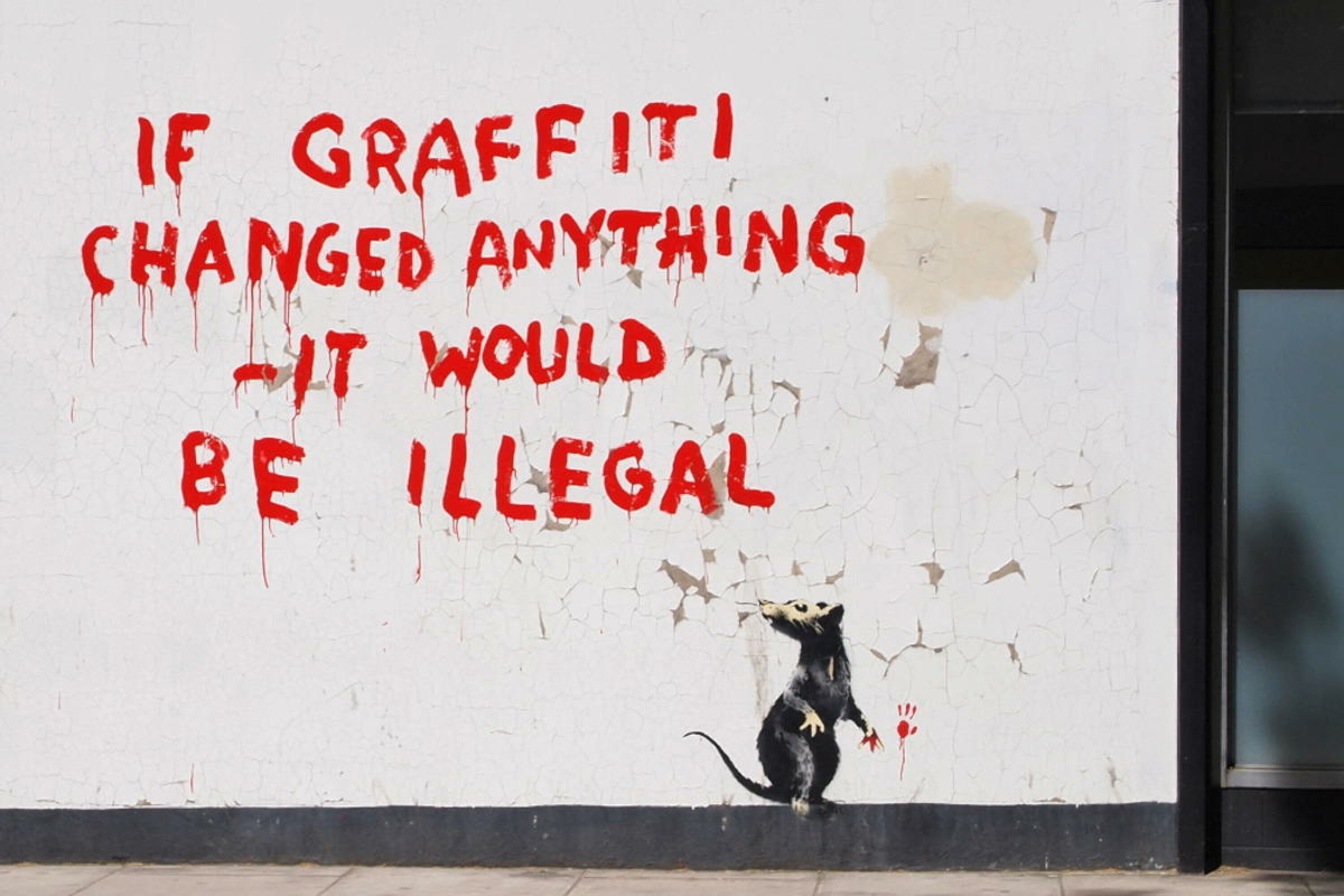
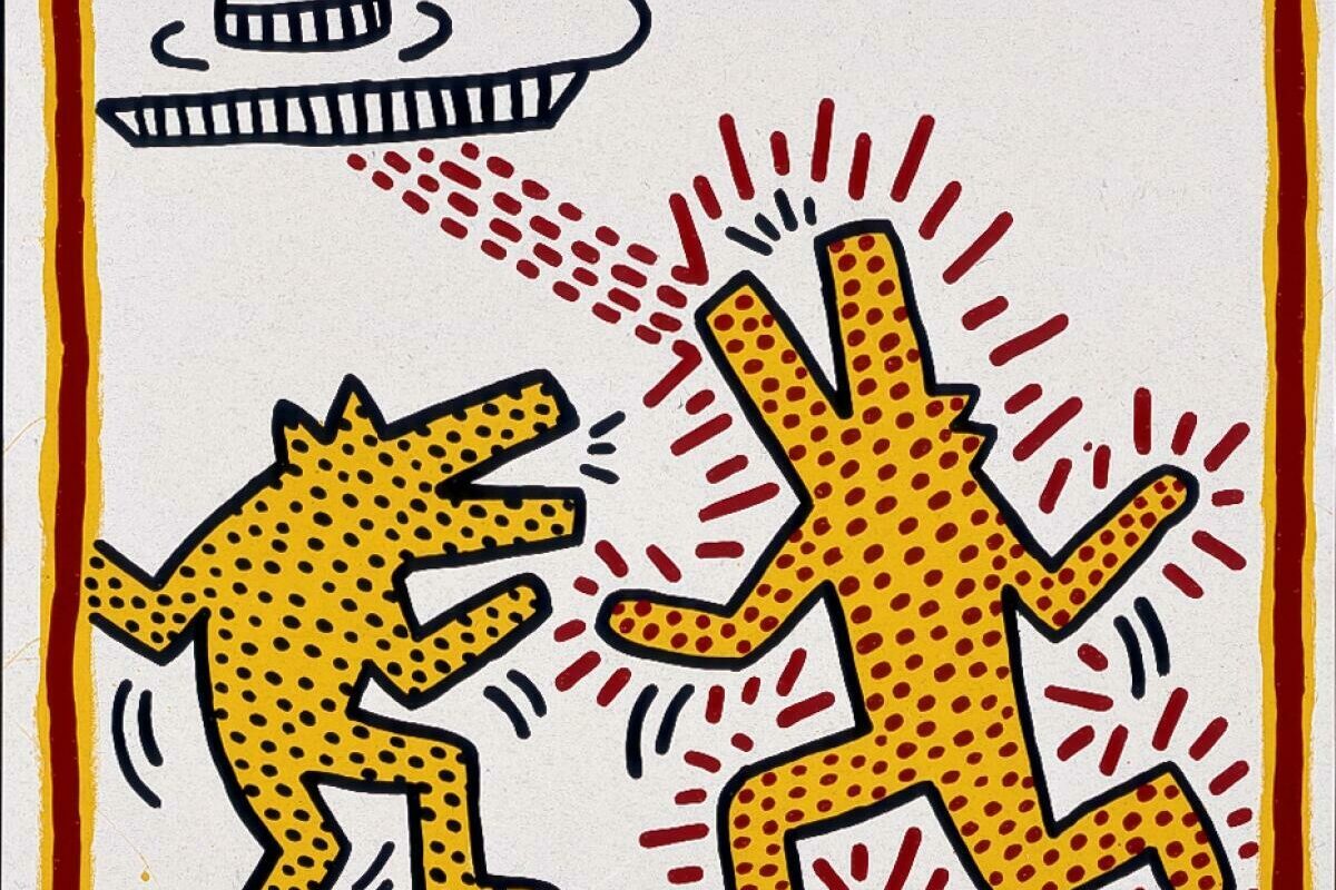
Fast forward a couple of millenia and graffiti again became the visual language of the city, when some of New York’s most famous artists emerged from the streets to revolutionise its galleries and museums. Basquiat launched his career by tagging the Big Apple with his pseudonym SAMO (Same Old Shit) alongside clever comments on contemporary society, before going on to incorporate scrawled slogans into his gallery work: the Basquiat editions we have for sale typify his style. Futura 2000 started out in a similar way, spraying incredible letter forms onto Subway trains: he later deconstructed these forms, stripping away the traditional alphabet to arrive at his own signature language of atoms and circles. As the decades have passed, the lines between graffiti and gallery art have been further blurred by artists with strong links to language – notably Banksy, who veers between red-painted scrawls and neat stencilling.
Modern Typography
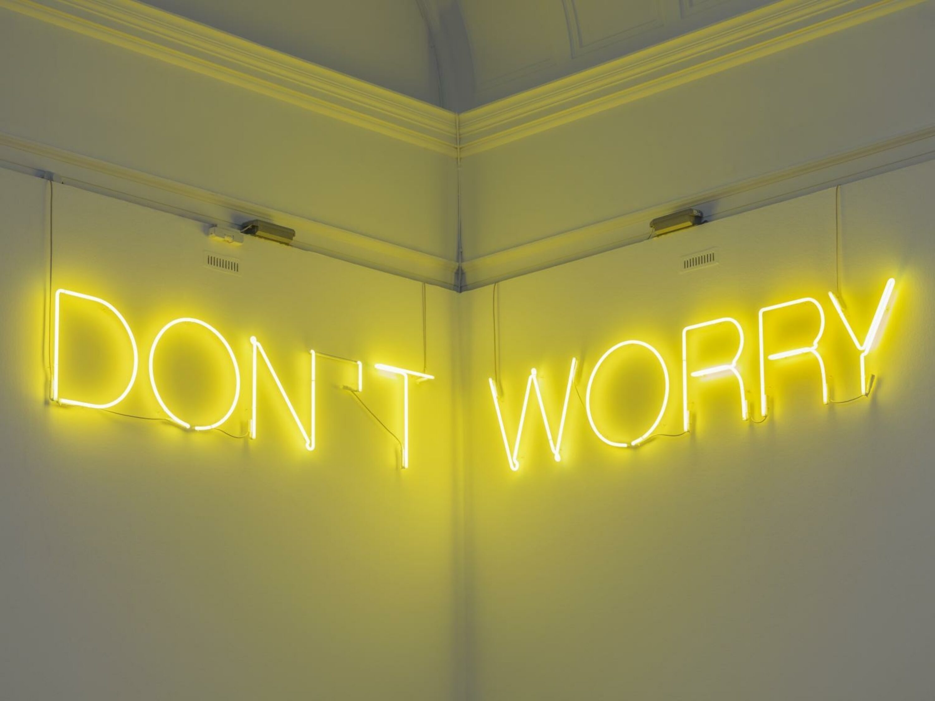
Since the 20th-century, typographic art has found a place in the mainstream, with an increasing number of artists experimenting with letter forms. In the 1980s and 90s, Barbara Kruger and Jenny Holzer honed a very modern way of playing with type, blowing up statements in bold typefaces that served to inspire thought in the viewer. Less confrontational but just as impactful, Martin Creed’s huge neon typographic pieces calm the reader with their outsized reassurances: slogans such as ‘don’t worry’ and ‘everything is going to be alright’ feel therapeutic when writ large on museum or university facades.
Tim Fishlock’s works have the opposite effect, drawing the viewer in with a fun aesthetic that’s almost tactile, before unsettling them with strong messages exploring our uneasy obsession with social media and technology. In carnival colours and signature shadowed type, his pieces look fun and nostalgic – at odds with the modern dichotomy they encompass.
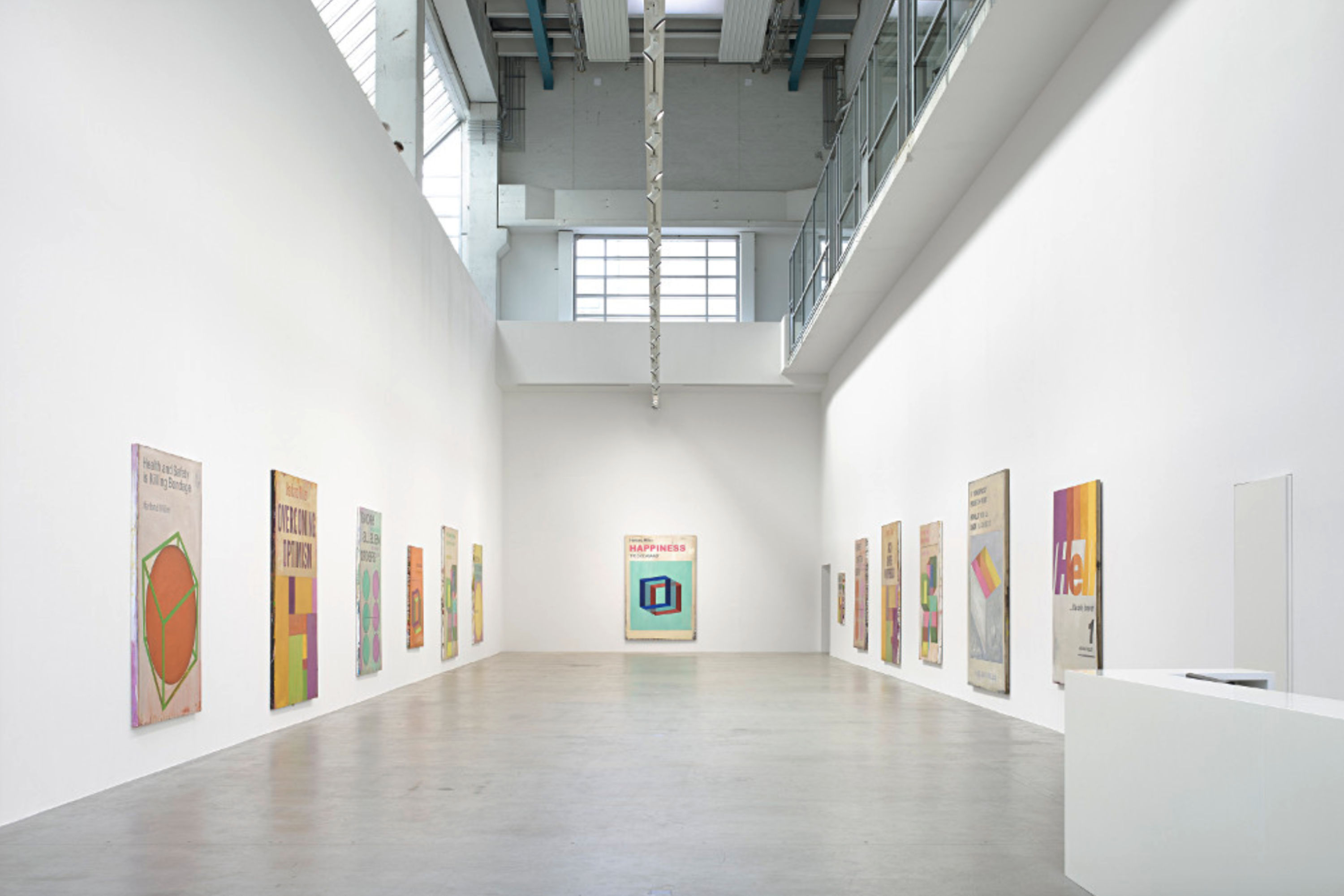
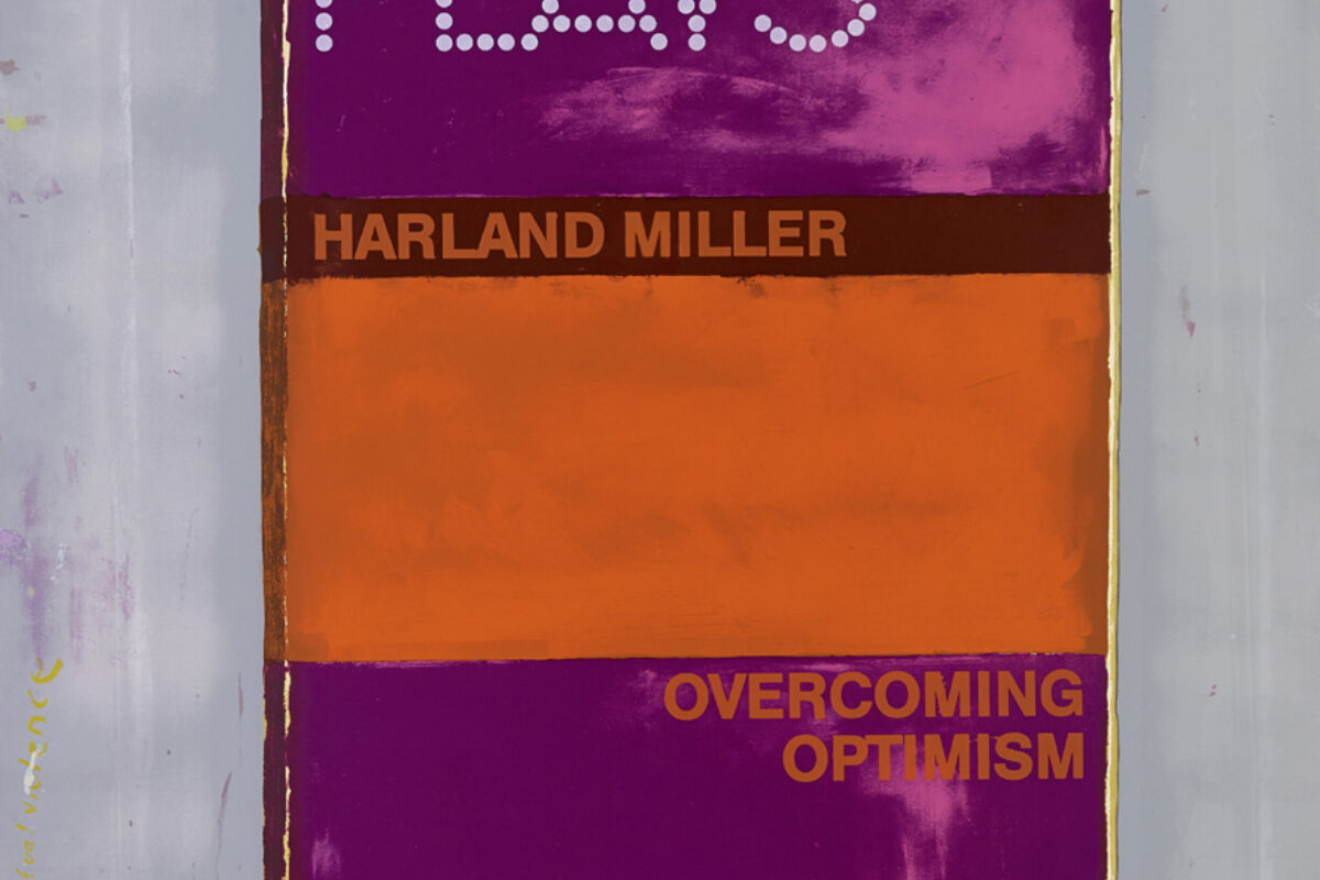
Harland Miller is another artist who turns expectations on their head with just one font. Drawing on the familiarity of the visual language used in Penguin books, Miller adds unexpected and irreverent slogans to much-loved formats, creating a tension between what’s on the canvas and what the reader anticipates (see You Can Rely On Me, I’ll Always Let You Down, which exemplifies his trademark style).
Scrawls and Scribblings
Though bold typefaces make clear and impactful visual statements, a freestyle approach to writing has the effect of seemingly giving the viewer access to the inner workings of the artist’s mind. This is evident in some of Tracey Emin’s more recent works, where uplifting messages in characterful handwriting accompany her drawings, filling them with love and hope. The fluid writing is at odds with her earlier pieces, where upper case letters shouted tragic statements – the change in styles helps to convey her developing story (for more confessional caps, it’s worth exploring the work of Sean Landers, which is by turns shocking and incredibly touching).
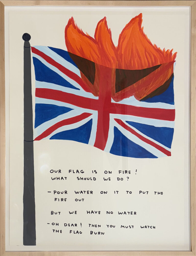
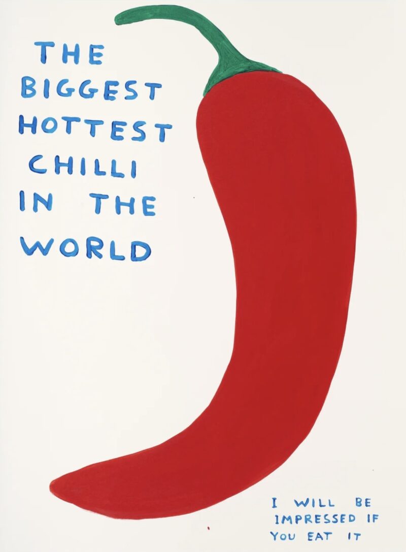
Another artist with instantly recognisable writing is David Shrigley, whose upper-case slogans and crossings out speak of the sublime and the ridiculous. So beloved is Shrigley’s writing that designers have made unofficial fonts which mimic his letter forms, and devotees can buy their own pencils and have a go at imitating the artist’s trademark caps-lock-satire themselves. We currently have several works featuring his witty commentary, which you can browse below.