
25 Aug 2026 5 min read
Keith Haring: Drawing the Dolphin
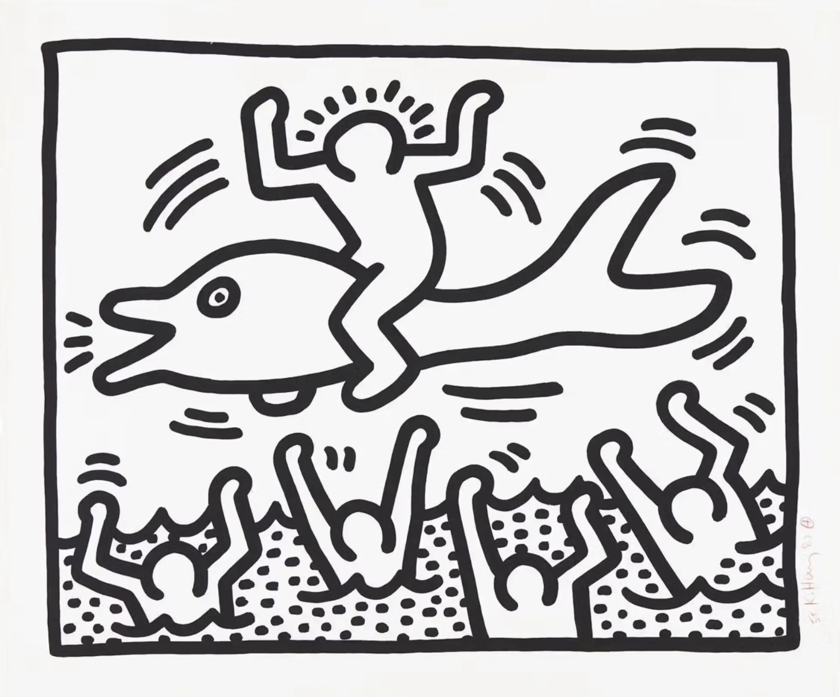
At first glance, Keith Haring’s "Man On Dolphin" appears playful and uncomplicated. Look a little closer, however, and the scene becomes harder to read. Joy or jeopardy, what is your interpretation? Through Haring’s unmistakable visual language, a seemingly simple image leaves us with far more questions than answers.
Few artists created a visual language as instantly recognisable as Keith Haring. Radiant babies, barking dogs, dancing bodies and figures in motion became part of an alphabet that Haring repeated across subway stations, gallery walls, posters, clothing and public spaces throughout the 1980s.
Man on Dolphin brings many of the qualities that defined his work together in a single image: apparent simplicity, underlying social commentary and an extraordinary economy of line.
At first glance, the composition appears almost effortless. A characteristically Haring-like figure balances astride a dolphin, arms thrown upwards as the animal rises above the water. Below, four figures wave their arms from within a dotted body of water. Are they cheering joyfully, or calling for help? As with much of Haring’s work, it is deliberately unclear.
The image is simple, but deceptively so.
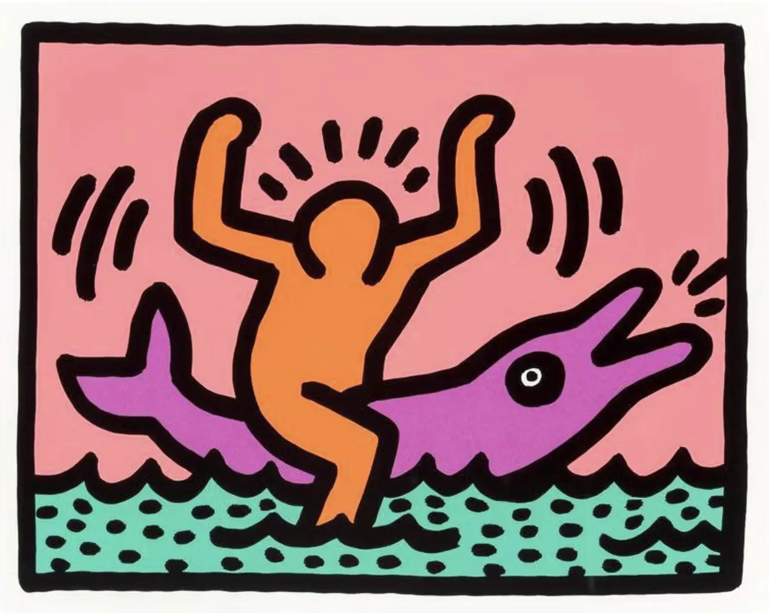
Haring, Pop Shop V (Plate II), 1989
Subway to Stardom
Haring developed his distinctive visual vocabulary on the streets of New York. After moving to the city in 1978 to study at the School of Visual Arts, he became immersed in a downtown scene where the boundaries between art, music, performance and nightlife were increasingly fluid. Jean-Michel Basquiat and Kenny Scharf were among his contemporaries, while Andy Warhol would become an important friend and influence.
It was the New York subway, however, that gave Haring his first truly public platform. During the early 1980s, he began drawing in chalk on the blank black advertising panels found throughout subway stations. Working quickly and in full view of commuters, he developed a visual vocabulary that needed to communicate almost immediately.
The limitations became part of the aesthetic. Complex detail was replaced by thick outlines. Individual identity gave way to universal figures. Short lines surrounding a body could suggest movement, sound or energy. Repeated symbols carried meaning without requiring words. Anything unnecessary was removed.
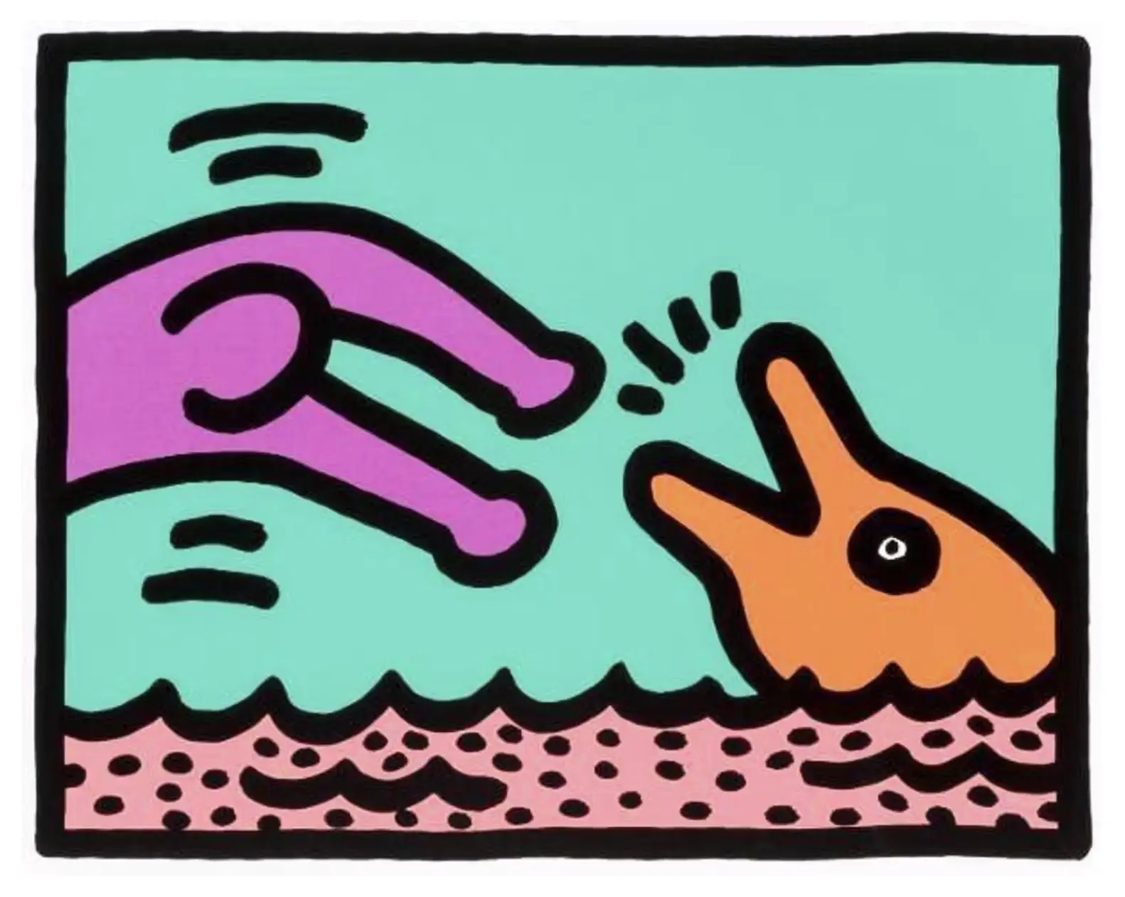
Haring, Pop Shop V (Plate I), 1989
Dolphin Deities
Animals appear frequently throughout Haring’s work, though rarely as straightforward representations of the natural world. Dogs, snakes and other creatures became part of his visual language, taking on meanings that shifted according to their context. The dolphin is a recurring example: traditionally associated with freedom, intelligence and play, its curved form lends itself naturally to Haring’s energetic line. His dolphins are often anthropomorphised, sometimes given legs or human expressions, or elevated to an almost deity-like status.
In Man on Dolphin, the animal appears to propel the central figure out of the water. Beneath him, the crowd either cheers his ascent or reaches upwards for the same escape. The figure on the dolphin raises both arms above his head, a gesture that could signal exhilaration or relief at having been saved. This uncertainty gives the image its tension.
Neither figure nor animal is rendered realistically. There are no facial features and no attempt at anatomical detail. What matters is the action. This anonymity is central to Haring’s work. His figures are rarely portraits of particular people. Instead, they become stand-ins for all of us.
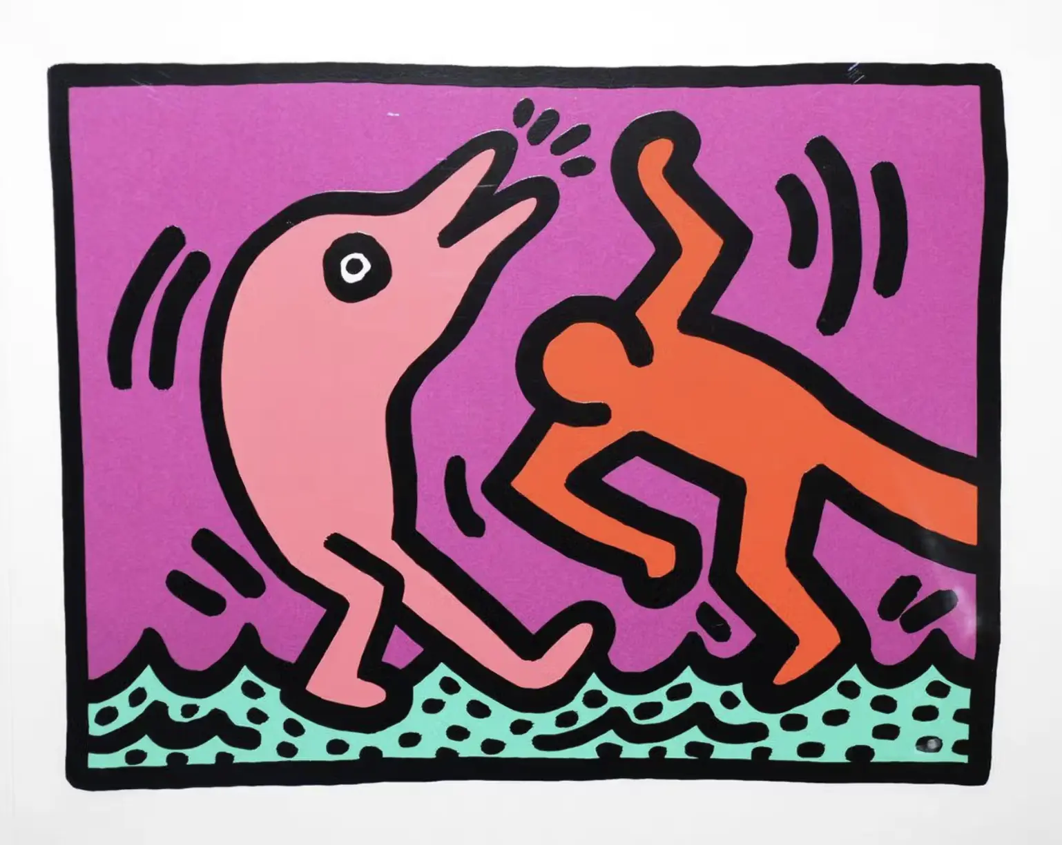
Haring, Pop Shop V (Plate IV), 1989
Movement in Motion
Haring understood movement exceptionally well. His figures dance, tumble, crawl, jump and collide. Even contained within a static image, they rarely feel still.
Part of this came from Haring’s fascination with dance and the club culture of 1980s New York. He was a regular at venues including the Paradise Garage, where music, performance and visual art existed alongside one another. Rhythm became embedded in the way he drew.
In Man on Dolphin, the sweeping curve of the dolphin drives the composition forward, giving the impression that it has just sprung from the water. Haring’s familiar action lines heighten this sense of energy. Nothing in the composition feels still.
It is also worth remembering that Haring often worked without preparatory sketches. Rather than carefully constructing an image before reproducing it, he frequently allowed a drawing to develop through the movement of his hand. His subway drawings were particularly unforgiving: created rapidly in chalk and in public, there was little opportunity for correction.
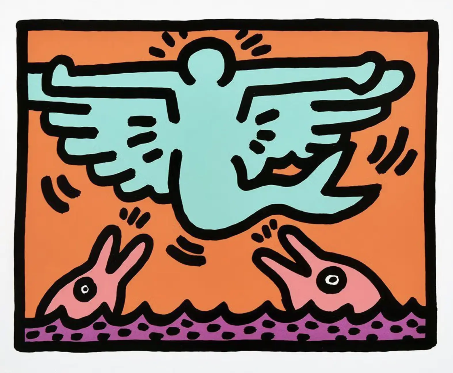
Haring, Pop Shop V (Plate III), 1989
It is easy to associate Haring exclusively with the visual culture of 1980s New York, but his work was never simply decorative. Behind the bright colours and cartoon-like figures was an artist deeply engaged with the world around him.
Haring used his imagery to address racism, apartheid, nuclear proliferation, drug addiction and the AIDS crisis. Following his own HIV diagnosis in 1988, his activism became increasingly connected with AIDS awareness and education. In 1989, he established the Keith Haring Foundation to preserve his work while supporting organisations working with children and people affected by HIV and AIDS. He died the following year, aged just 31.
The brevity of Haring’s career makes the scale of his cultural impact all the more extraordinary. In little more than a decade, he moved from drawing anonymously in subway stations to becoming one of the most recognisable artists in the world. More importantly, the images outlived the decade that produced them.
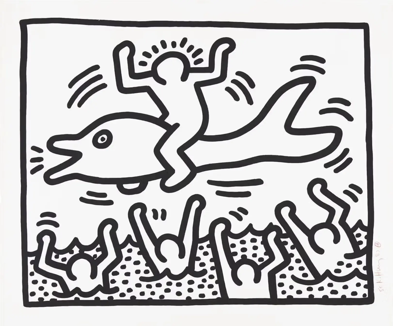
Haring, Man On Dolphin, 1987
Joy or Jeopardy?
Man on Dolphin is quintessential Haring: instantly accessible, yet surprisingly difficult to decipher once you begin to look more closely. It can be read as joyful, but there is an undercurrent of anxiety. One figure appears triumphant while those below may be celebrating with him, or asking to be pulled from the water themselves.
Haring gives us no answer, and that is precisely the point. With a handful of lines and a seemingly simple image, he leaves enough unresolved to keep us looking. That tension between immediacy and ambiguity is perhaps why Keith Haring’s visual language has proved impossible to forget.
Works Available
Enquire hereContributors
Louis Denizet
More about Andy Warhol
-
29 Sept 2026 3 min read
Why Raymond Pettibon Keeps Returning to the Wave
For more than 40 years, across works on canvas, paper, and prints, the wave has been a leitmotif in his...
-
22 Sept 2026 3 min read
Inside the $6.7 Million Warhol Fraud, and What It Means for Collectors
Imagine spending millions on what you believe is a pristine collection of Andy Warhol prints, only to discover you've bought...
-
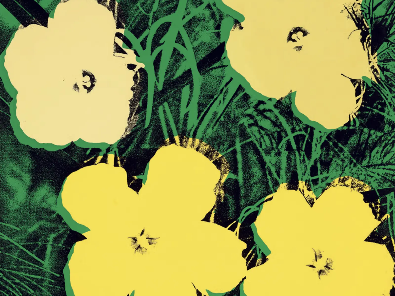
25 Aug 2026 5 min read
Andy Warhol’s Flowers: How the Humble Hibiscus Became a Pop Icon
From delicate hand-drawn roses to electric hibiscus blooms, flowers were a recurring motif throughout Andy Warhol's career. At once beautiful...
-
03 Jul 2026 5 min read
The Hang - Your Quarterly Art Market Briefing | Q2 2026
What moved the market, made headlines and mattered most this quarter. Digest the important moments of Q2 with The Hang.
-
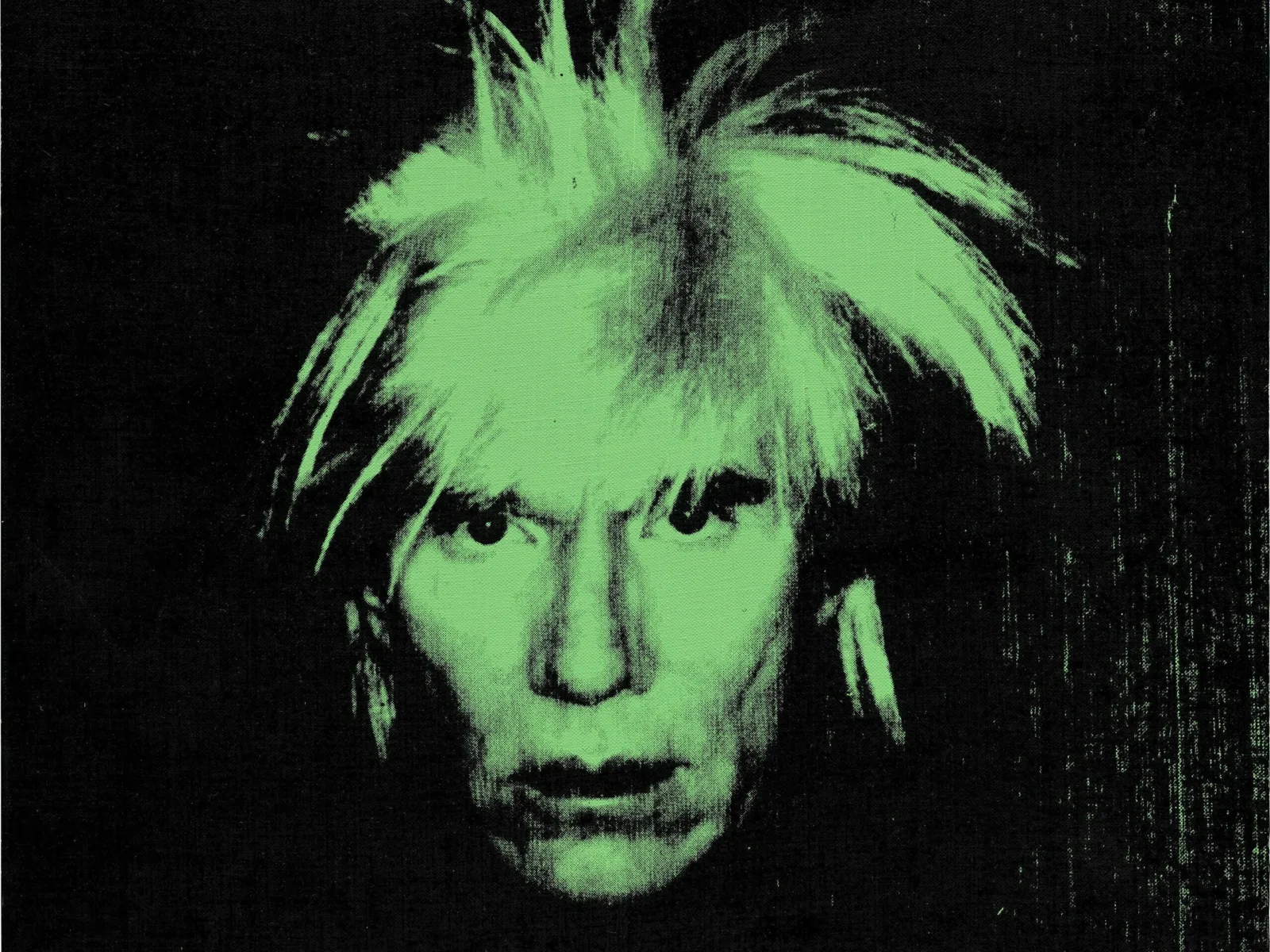
08 Jun 2026 4 min read
Warhol Wows at Auction
The spring auction season has delivered another powerful endorsement of Andy Warhol's enduring market appeal, with strong results recorded across...
-
26 Mar 2026
Renewed Momentum: The Global Art Market Enters a New Phase of Growth
The global art market has returned to growth, driven by renewed strength at the high end and a more balanced...
-
08 Jan 2026
Why January is the Best Time to Buy
January is often seen as a pause in the art world. In reality, it is one of the most constructive...
-
04 Jan 2026 3 min read
Andy Warhol and Brigitte Bardot
Brigitte Bardot became one of the defining faces of modern celebrity, and Andy Warhol recognised in her image the perfect...
-
21 Nov 2025 7 min read
Why Collectors Are Obsessed with Warhol’s Endangered Icons?
Andy Warhol’s 1983 Endangered Species series transformed threatened animals into pop culture icons, using his bold, technicolour style to spotlight...
-
13 Oct 2025 3 min read
Your London Art Week Guide 2025
London Art Week has arrived, and with so much going on, we have done the legwork so you have a...
-
13 Oct 2025 2 min read
Market Watch: Kusama Auction Results
The start of the autumn season has seen some great results for Yayoi Kusama. We've compiled the showstoppers that may...
-
07 Oct 2025 2 min read
Top 5 Selling Warhol Works
We take a look at the top prices paid at auction for complete sets of screenprints created by Andy Warhol
More from Artists
-
06 Oct 2026 4 min read
Warhol Without Limits: Rare Works Revealed
Think you know Warhol? Look again. Behind the celebrity portraits lies a wealth of drawings and rare prints that reveal...
-
05 Oct 2026 4 min read
Banksy, Self-destruction and the Art of the Spectacle
Eight years ago, one of the most talked-about moments in contemporary art unfolded in the middle of a Sotheby’s auction...
-
29 Sept 2026 3 min read
Why Raymond Pettibon Keeps Returning to the Wave
For more than 40 years, across works on canvas, paper, and prints, the wave has been a leitmotif in his...
-
29 Sept 2026 4 min read
From Vasarely to Egypt: 5+1 Influences to Unpack Bridget Riley’s Practice
If you’ve ever stood in front of a Bridget Riley painting, you know that looking at her work is a...
-
27 Aug 2026
Yayoi Kusama: 1929-2026
Arguably the most important Asian artist of the century and one of the most influential women to shape the global...
-
25 Aug 2026 5 min read
Andy Warhol’s Flowers: How the Humble Hibiscus Became a Pop Icon
From delicate hand-drawn roses to electric hibiscus blooms, flowers were a recurring motif throughout Andy Warhol's career. At once beautiful...
-

10 Aug 2026 3 min read
Yayoi Kusama breaks visitor records in Cologne
The record-breaking Yayoi Kusama exhibition at Cologne’s Museum Ludwig drew 480,335 visitors; the highest attendance in the museum’s history, before...
-
23 Jul 2026 2 min read
A Reoccurring Motif: Pumpkins Across Kusama's Artistic Practice
The pumpkin is one of Yayoi Kusama's most enduring motifs, embodying themes of memory, repetition, comfort, and transformation that recur...
-
20 Jul 2026 3 min read
Collector's Guide: Damien Hirst | Spots
Once you become synonymous with an image, have you hit the big time? There are 3 main subjects that Damien...
-

13 Jul 2026 3 min read
Collector's Guide: Bridget Riley | Lozenges Series
Take a deep dive into one of Bridget Riley's most acclaimed series: Lozenges.
-
05 Jul 2026
David Hockney - A Life of Looking
David Hockney has died aged 88. He was artist who will be remembered for an illustrious career that spanned many...
-
22 Jun 2026
A Life Size example of Banksy’s Love Is In The Air Headlined Sotheby’s Evening Sale
One of Banksy’s most enduring images headlined Sotheby’s Modern & Contemporary Evening Auction in London this week, as Love Is...